
Sustainable Brand Development, Packaging Design & Branding
for Oaxacan Moon Herbals


Wholistic, hand crafted, sustainable artistic, eco-chic, and at the core: an ethical approach to promote things that have not yet been discovered while supporting a small non-industrialized community.
Those are the driving thoughts and values we wanted to allude to while designing Oaxacan Moon Herbals branding. If you’re curious, the products will be available in high-end spas in the greater Los Angeles area that provide health services like vitamin drips, facials and other spa services. Knowing our audience are those who visit spas like these was a major factor in developing the brand.
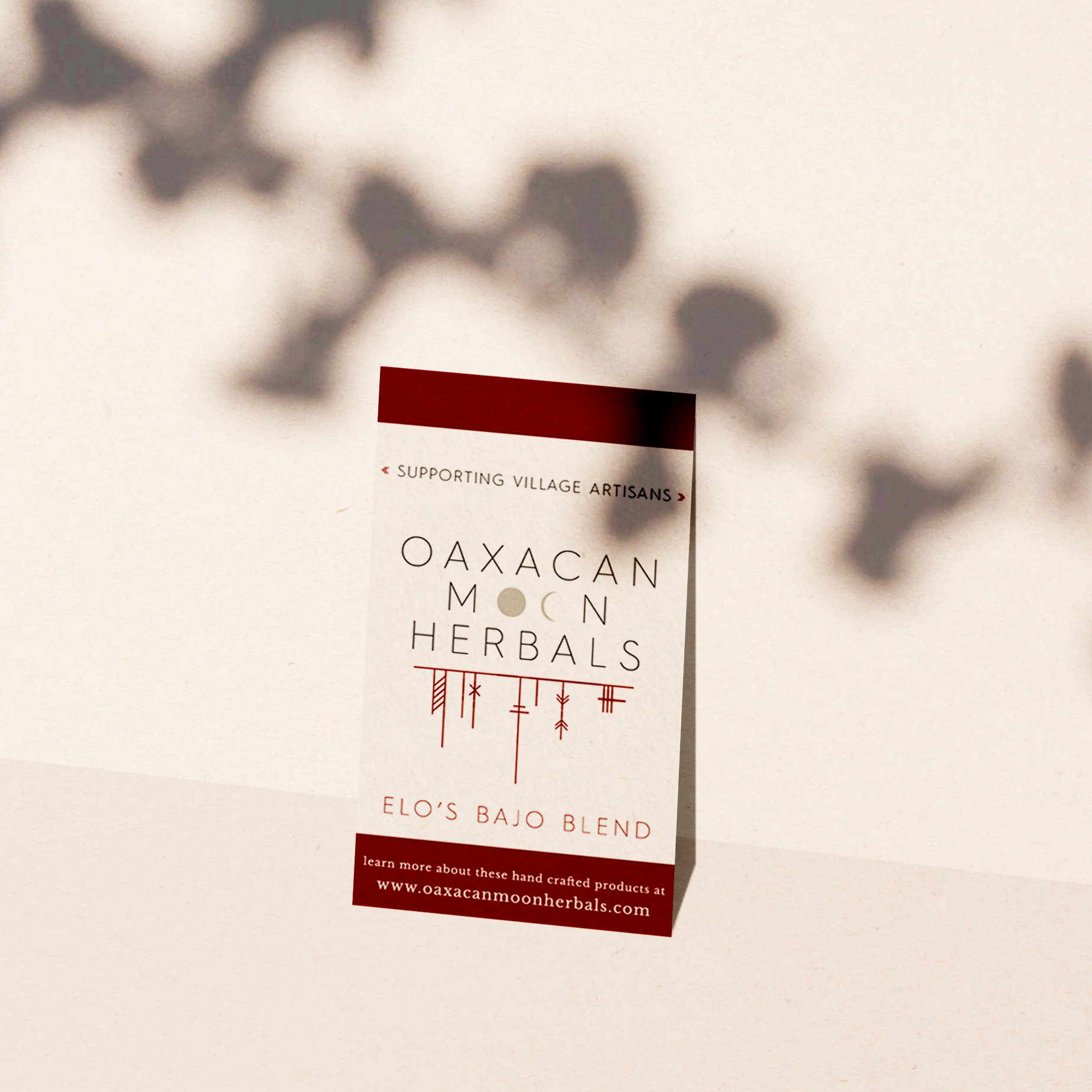
The logo needed to be simple, modern and professional. But the packaging needed to have a nod to the fact that all of the products are hand made by artisans in a small village in Oaxaca. At first we went the route of including aztec style patterns in the main logo, but eventually decided that a modern approach would work better when being sold in luxury spas. We wanted the designs to stand out, but not be so different that they looked out of place next to other luxury products that would be on display in the spas. Once we had the initial mark, we continued building the graphic arsenal that would be used wherever the products are sold or promoted. Creating a special mark for social media channels, a vertical mark to be used when necessary, and a circular secondary mark to be used when a perfect square is needed.
We continued building out the brand by developed a typography palette for Oaxacan Moon Herbals. Typography palettes are important because they help create the instant recognition that great branding will do for a company. The fonts chosen portray the luxuriousness and exclusiveness of the products. While the company would love to share the products with the world, for now they are only available to a select group of people. This is portrayed through the typography since the fonts chosen have a slightly handmade texture, due to the incongruent width of the letters. The typography is defined as humanist, meaning that the lines are not geometric (which can end up looking like it was created by a computer), while still staying extremely easy to read and elegant. Humanist serif fonts were chosen for any header text in order to reflectthe non-industrialized manner by which they curate their limited products.
The external image we wanted to portray through the product branding is that the products are natural in every way. The base ingredients are grown and curated from a location that is only accessible on foot (or by donkey, which is how they transport their goods). The brand will meet the needs of conscientious female consumers who care about ethics and are thoughtful about what they purchase.
Developing an editorial voice for our clients to follow was another must for this project so that once website development, marketing and content creation begins, the company will know how to write without alienating their ideal target market. The OMH editorial voice is warm, knowledgeable and a no-fuss advocate for natural products. The goal of their content will be to share knowledge through creating dialogue, and they’ll do that by keeping discussions friendly and warm.
The OMH team also has goals of expanding the product line to include more handmade artisan goods. For this reason the product packaging needed to all look cohesive and be easily interchangeable when new products are introduced.
We created packaging for multiple products in this way. We also created the brand guide below, to help the company thrive once we were finished working together.